Kids Land | Hansol Education Corp
A versatile brand identity design for a media company
Project: Rebranding
Role: Creative Lead, CollaboHQ

A subsidiary brand that has shared history with a company needs a refining process as the taste of consumers changes. Hansol Education Corp, the largest kids media company in Korea, requested a rebranding project to refine their oldest subsidiary brand, Kidsland(Sin-Gi-Han-Na-Ra).
A great logo should be versatile. The previous logo was limited to be used on various logo applications because the brand name took a large part of its logo symbol.

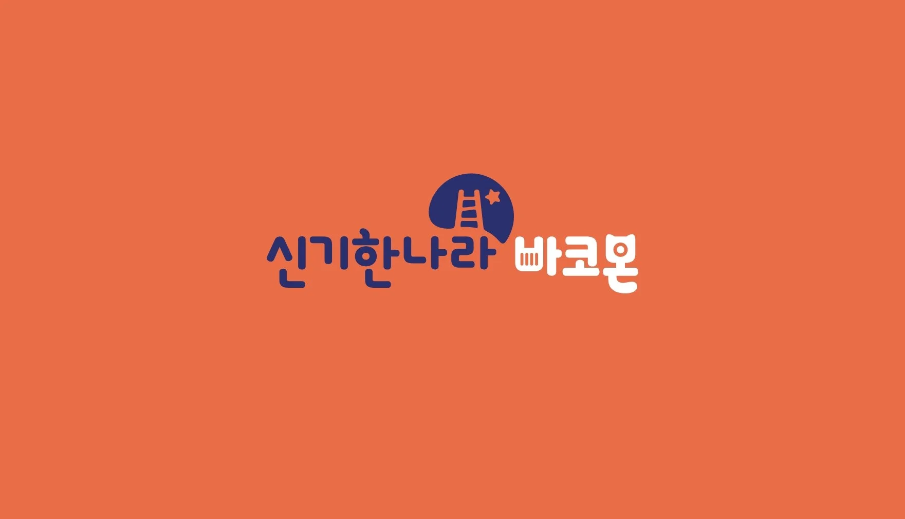
To improve the applicability and readability, I focused on redefining a visualization of a ladder and a star to capture the idea of children’s growing imagination and thinking skills through educational experiences.
Developing the signature ladder and the star by using negative space in the shape of the thinking bubble makes the logo bolder.
Brand System
By placing the brandmark on the upper right side, the new logo creates a free and dynamic atmosphere yet gives more flexibility to the applicability. No matter what class subjects applies to the wordmark, the readability of the logo and the brand image maintain.
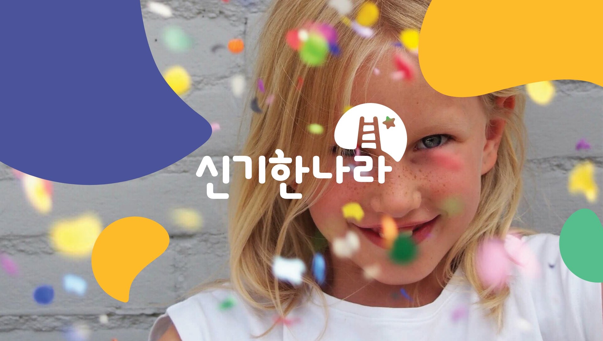
Color and Shape
The new color palette is derived from the dark blue logo, slightly darkened from the previous logo. The deep blue allows the logo to be used with less restriction while vibrant colors for each subject give an “imaginative” look. Additionally, a library of expressive and functional shapes adapts to all Kidsland media channels.


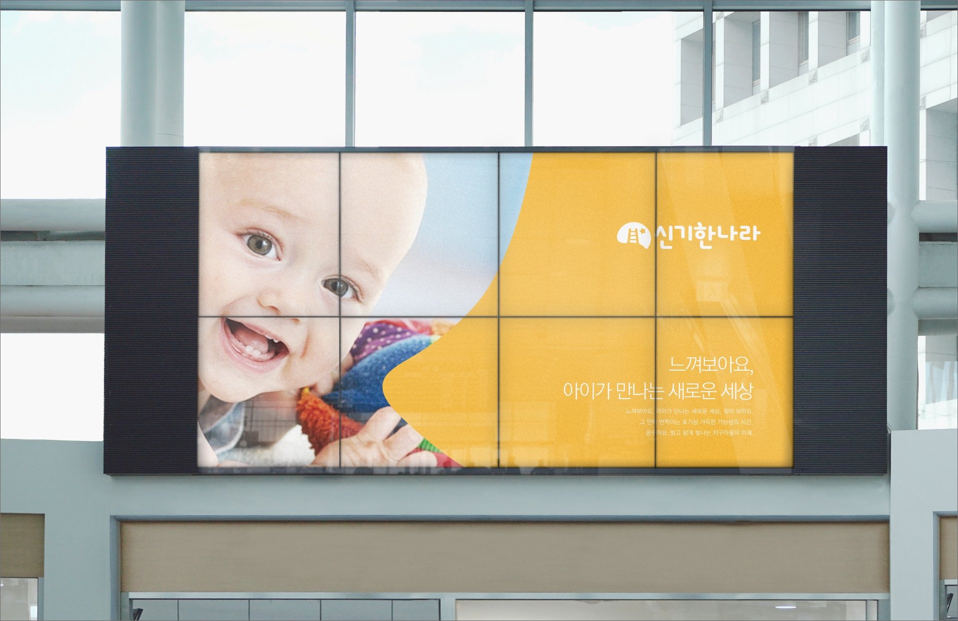
For extended applicability, I worked with the RND Plus team to support Kidsland's limitless use of its new brand identity for different marketing channels.


